Today, our teacher showed us a very interesting website: The Art Of The Title.
This is a real web resource of film and television titles, from around the world. They analyze and discuss excellent title sequences, the way they have made it and discuss the font they have used.
The Fonts... That’s what we were talking about in our last lesson! Different fonts are used in title sequences, but they don’t just write a paragraph with all the names of the actors at the start of the film... No no no. They have to make it look good, so that the audience is already “watching” the film!
There are several kinds of title sequences...
A narrative title sequence is when the audience is immediately introduced to the location, the setting and the characters.
This is a classic narrative opening. I really like what they have done with the font of the titles! It tells us something isn't right, that something is not normal (The sense of "anormality" starts when the audience see the opening titles). It starts with an establishing shots of New York, followed by the introduction of three female characters.
I think this opening is very effective because the way they have designed the titles (choice of the font, effects added...) It gets your attention directly from the beginning !
A discrete title sequence is done separately from the film. The sequence is heavily edited and stylised, and they usually last for the opening credits and the title.
Wow, this is disturbing! The sound and the effects used are very creepy, and don’t make you feel comfortable. The effects added to the music emphasise this feeling. And the way the font appears, or keeps moving, doesn’t help! This is a very beautiful (if I can say!) opening sequence. A lot of work in the editing process made this title sequence very effective. However, I found it a bit "boring". Yes, it does make you feel uncormfortable but it is long! The fact that the title sequence isn't connected to the opening sequence makes it worse I think, it almost feels like it's another long wait before you can finally start watching the movie...
Or perhaps you would like a blank screen!
Some films show their opening credits over a blank screen, before introducing the image. Sometimes though, the titles continue to appear after the image has been introduced.
"Fonts convey an emotion without actually having to say the words"
This is why the choice of a font is really important in a title sequence. But before we can choose a font, we need to think about it carefully.
There are two types of fonts...
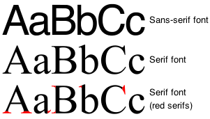
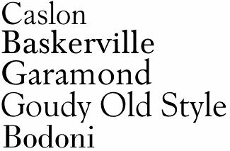
Serif Fonts - Such as Times or Courrier.
They are more traditional and more formal. The word Serif describes the detail at the end of each strokes for each letters.
They are more traditional and more formal. The word Serif describes the detail at the end of each strokes for each letters.
 |
| Serif Fonts |
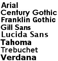
Sans Serif Fonts - Such as Arial or Trebuchet. They are more modern and less formal. The word Sans, taken from the French language, means "without" in english. So "Without the little detail".
 | |||
| Sans Serif Fonts |
 |
| Scott Pilgrim vs The World - The Art Of The Title Sequence |
Let's see how do they do it...
I have made a little video for you! I thought it would be easier and better for me to analyze this opening... Straight on the video! So watch, relax and enjoy... (Although you will still have to read a bit more afterwards! Sorry...)
Video taken from The Art Of The Title
I found this opening sequence amazing, it was very well done!!! The opening credits were included in a very good way, the graphics are awesome and puts us straight in the mood of the film.
No comments:
Post a Comment